Saturday, September 13, 2014

Fancy this!

Here's a little ATC project I did on a day when I was seriously needing sunshine. I love ATCs because the small canvas makes you focus. It keeps you from letting your project mushroom out of control (yes, I struggle with KISS!).


I drew this by hand (an ATC is 2.5 x 3.5 inches), and colored it with prismacolor pencils. I 'melted' the wax in the pencil to blend the color using the Gamsol method. I used Viva modeling cream in gold for the edges. I really love how this turned out. It's much more vibrant in person.

Ta for now,

~ky

Friday, April 4, 2014

Thinking Tulips

It's that time again! We have a new mixed media challenge over on SCS. This week, Birgit has challenged us to make brightly colored tulips with our mixed media supplies. We've had about a week of dreary grey skies and very little rain, so I was ready for pretty flowers and bright colors.


I took a piece of mixed media paper from my Canson pad, wet it with water, then sprayed over Dylusions lemon zest and funky fuschia. I dried it and repeated. After it was thoroughly dry, I splatter water over the piece to create those beautiful tonal dots. 

I stamped Gina K Designs tulips and sentiment in 3 colors of distress ink on cream cardstock. I mounted that on a bright pink piece of cardstock, punched a little notch to hold the twine wrap and bow. This was mounted on foam to give lovely dimension. I stamped the floral border with Versamark and heat embossed with clear powder. Just couldn't resist some stacked sequins with a little rhinestone on top.

I hope you'll take a few minutes to play this weekend - you deserve some fun! Thanks for stopping by and leaving a note, especially if you have a question. Enjoy!

~ky

Ingredients:
Stamps: GKD Stenciled Spring, SU! You're Lovely
Cardstock: GKD, Canson mixed media
Inks: Dylusions and Distress Ink
Twine by the Twinery
Sequins and rhinestones

Monday, March 24, 2014

Slow Down and Enjoy the Colors

Click any image and you can scroll through them.
Well, have you? Slowed down? I'm trying to. We are finally getting into a rhythm here, and it's nice. So I'm trying to remind myself that some things can wait a few extra minutes or even a day. I want to focus on 'feeling' each minute instead of rushing through.


Part of getting back into a routine involves singing with my choir, and being refreshed by my church each week. There's lots of negative in the world, but we manage to set that aside when we come together. It's important to always put positive back into the world if you hope to get any back.


I want to remember to do it NOW. There's no time like the present, right? But we still put things off until one day we're standing with our hat in our hands waving goodbye to something or someone we should have held closer.


For me, ultimately, it's all about TRUST - trusting God, knowing my worrying won't change anything, but prayer can. Often, it really means I just have to LET GO of some things. That's so hard, even though it sounds simple.


I made this page in my art journal for the SplitcoastStampers mix-abilities challenge to use text in your mixed media piece. It's the outer layer on each kite. I also used the prompt from The Documented Life to incorporate something you've recycled. The centerpiece for the kites is cut from my table protector layer of butcher paper. The list of products is down below.

Thanks for stopping by today. I hope I've inspired you to pull out your toys and play. Come share what you do on SCS - we'd love a chance to share with you!

Ta for now,
~ky

Process and products: Canson 98 lb 7x10 inch mixed media paper, sprayed with water, then Dylusions sprays (After Midnight, London Blue, Melted Chocolate over wet paper, and through Crafter's Workshop stencil). Edged using modeling paste colored with Dylusions sprays, pressed through Dylusions stencils, outlined with Pitt and Copic Multiliner markers, highlighted with Copic Opaque White), clear, colored and holographic sequins are topped with rhinestones and seed beads, and there's a bit of drywall tape, Tim Holtz washi tape, and snippets of words from Rhona Farreh digital bundle. There's random blobs of gesso, too, and a Plaid Fleur de Lis stencil. I think I used every color of Dylusions sprays that she makes up to this date. I see there are new colors coming very soon! Any questions about products? Please feel free to ask!

Friday, March 14, 2014

Bag it!

Janelle is our hostess this week for the Mix-Ability challenge on Splitcoast Stampers, and boy is it a fun one. Lots of people are wanting to explore the glamour of a Gelli Plate, but can't commit to the expense of buying one. I showed you how to make a permanent, DIY plate in THIS POST, but I know some of you are intimidated, don't have the time, or are like me - just too busy/lazy. HA! So Janelle's challenge is to do the faux-gelli technique using a simple plastic baggie as demonstrated in:


Here's my take on using this technique and a few things I discovered. First, I put my plastic baggie on my glass cradle board. This is a piece of repurposed glass that I taped and use as a lap-desk while I'm stuck in bed - nothing you need to do this technique (I just didn't want you confused by my bedspread underneath).

Tip: You can click any picture and scroll through them in order for a more detailed view.


On my baggie, I put various sized paper circles and strips. I did this to preserve some 'white' space - areas where there won't be any paint. This is important if you want to see the paper you're printing over through the paint. I dropped blobs of paint, then brayered it over the baggie.


**First Grrrrr moment: these bits of paper do NOT stay put on the baggie like they will on an actual plate. The will stick to your brayer like dust on a black kitteh! Be aware of that, and skip this paper masking, or be prepared to fuss with them A LOT.**


This is my plastic baggie after a couple of prints have been lifted. You can still see some areas devoid of paint where my bedspread shows through. ** Second Grrrr moment: paint dries REALLY FAST using this technique and does not respond like it will on a plate. ** Minor technical glitch: I didn't get photos of some of the in-between printings, but if you watch Alisa's video, then my step-by-step photos, I think you'll get the picture.


Here are some of my prints - the one in the upper left was a straight pull - meaning I didn't reapply paint and press it onto the paper over and over. I applied all the paint I wanted (some is glitter paint) to the baggie, then pressed it to the paper only once. The others I pressed on 2 or 3 times. You can see the faint repeat of the big yellow flower on the bottom center cardstock. All of these were printed on Gina K Designs pure luxury cardstock. Paints were cheap craft stuff and some more expensive Golden Fluid Acrylics. The craft stuff actually performed better (and I have heard this from many other people using regular gelli plates).


This one is a little different. I printed on a used manila file folder, reapplied paint, and printed over my first one, etc. Next, I cut all of these pieces down to 8 1/8 inches square and turned them into envelopes as the Envelope Board instructs. This is where the magic begins.

These prints are a little flat, a little chaotic, and frankly, directionless. How do you figure out the next step? Decide on a focal point. For me, I wanted these envelopes to contain some random goodies - leftovers from past projects, bits of product laying around my studio, etc. to gift to another crafter via 'happy mail'. I have a really cool sentiment from Stampin Up! Trust God sentiment set. It says "God has given us two hands -- one to receive with and the other to give with. ~Billy Graham. Perfect!

I needed HEARTS to convey the love from one artist to another.  So I cut hearts out of those pesky pieces of circles that grabbed onto my brayer up in step 2. Ha! That'll teach you to mess with me!


I hope you can flip that image over in your mind, because I turned it when I decided the orientation for the envelope - the big pink flower that was lower left is now upper right. I put some gesso in a heart shape in the left corner, added some stamped washi tape (SU!'s Tape It set), rubbed more gesso through stencils (the white ghosted areas), shaded around the gesso heart to make it pop with some dimension, and over-stenciled with gold modeling creme. I used a variety of product - if you have a specific question, ask in the comments or look in the ingredients at the bottom of this post.

Isn't that FUN? Magical? It makes me giddy! I want to send envelopes like this to pay bills in - just because the job of opening bills and logging payments must get incredibly boring and those people deserve art, too! Here's some more:


This one was similar, but it has some extra glitter paint, different stencils, some pen work. Just go with the flow. I also used SU!'s Gorgeous Grunge set on this one. Love that! And finally....


BOOM! Heehee!! This one makes me so HAPPY! I wanna dance! That gorgeous color really pops on the black cardstock. This is one virtue of paint over ink on dark paper. It's opaque. It's rich. It's playful!

Did I say that was the last one? Well, it was. Sort of. I have a by-product fun piece for you too. I hate to throw things away. I blame my parents, who were children of the great depression and dust bowl era. We were taught to use every little bit of everything we had (#noIamNOTaHoarder). I saw all the beautiful bits of paint and glitter stuck to my now well-worn piece of plastic baggie, and me-thunk an idea. Packaging tape. I put packaging tape over the paint on my baggie. It's now sandwiched so the glitter can't rub off, and the paint won't get scraped off. And it's sturdy enough to go through my paper cutter. And my die machine... I now have...

SUPER WASHI TAPE!

^^CLICK ME ^^
for a better view.

YES I LOVE IT!! Can you see the little bits of white fabric showing through? Yes, those spots are clear, so you can glue it down and still see some of the fabulousness beneath it. Fun fun fun!

I'm running around throwing confetti, so I'd better step away from the computer. I hope you give this technique a try, and please share with us (even if it flops) over on Splitcoast. We celebrate trying things over there. Better to try and fail than to have a really clean, neat studio. Go make some magic and mail it to a random person!

Ta for now,
~ky

Ingredients:
Paper - Gina K Designs pure luxury cardstock - ivory, warm cocoa, black
Paints - Golden Fluid Acrylics, Bella Acrylic (craft, from Home Depot) assorted colors including glitter
Artist's Choice gesso
General's charcoal pencil, 8B
Copic multiliner pens
SU! Stamp sets: Tape It, Trust God, Gorgeous Grunge
Dylusions stencils: Diamond of a Border; Letter Jumble; Chequered Dots; 
Crafter's Workshop stencils: Mini Punchinella; Microbial
Viva Colour for Creative Imaginations gold Modeling Cream
Inks: Archival Ink (Ranger) coffee, jet black; Gina K Designs turquoise sea, sweet mango, cherry red, and fresh asparagus; Versafine onyx black, and Memories white dye ink pad by Stewart Superior
Plastic kitchen baggie, 3M packaging tape

Monday, March 10, 2014

What a week!


This was my week. We had an ice storm that was phenomenal, luckily that's the only real damage we sustained. Dad's doing much better being home and getting back into his routine. He's almost to the end of physical therapy. Yay! Thanks so much to everyone who asks about him. 

Dealing with the aftermath of the storm and the comments of people who criticize, pretend to want to help, then back out, and those who completely blindside you when you try to take a moment to help someone else were all catalysts for creating this 2-page spread in my art journal.

Those who stop growing start barking at others.

We should all be focused on growing ourselves, and lending helping hands to others that are trying to find their way. It's just too sad to see people bent on tearing someone else down because they don't desire, or are frustrated by their own growth. Yep. Even in the art world there are those that want to nip at others as away to elevate themselves (hint: that never works!). And no. This isn't aimed at anyone in particular. And yes, it goes beyond the art world. I'm doing it all wrong, caring for my Dad this way. Hahahaha! Bugger off.


She really has an attitude of perturbment (lookie, a new word!). Honest - she came out of my pencil that way. I didn't even have to encourage her any. She's just minding her own business, running her own little world of nightmares and inspiring chaos when this clashing noise shatters her focus. Hahaha! Sort of like SXSW, eh Lydia?


Now, some of you know I am one of the design team members for Splitcoast Stamper's Mix-Ability Challenge. We challenge you each Friday to learn and grow into mixed media art, and it's not scary or demanding. In fact, we'll hold your hand every step of the way if you need it. Jeanne Streiff is our hostess this week, and she's challenged us to use watercolors, blended and run together, to create our background. I chose Dylusions water-based ink sprays for the back ground. That's when it developed a life of its own and I was merely along for the ride.


Then the Documented Life Project challenge came, asking for a bird or wings, so suddenly I had butterflies from a Heidi Swapp stencil showing up, and a bird that sang to me about the art of Sunny Carvalho through a die cut of Tim Holtz. It got psychedelic, man! (George Carlin would be so proud)


The zendoodle bug hit (thanks, Kelli Jo!), and these graphic tails and swirls started popping up and turning into random bird cats and fern coils. Wow! What an adventure I had! I couldn't put someone in this spread without a nod to Alice (see that really long neck?).

Some random cat-woman named Lydia asked about the sharp lines and vibrant color. Lydia, this is my process: I started with Dylusions spray. I overlaid a couple of stencils (the ovals on the left, the florals on the bottom of both pages, the butterflies), 'cut in' with watered down gesso, then outlined with Copic multiliners, and shaded with Sennelier oil pastels, fixed with a quick light coat of Mod Podge. I kept layering things, shading around them, smudging them into the background with a little paint, some stamps, a bit of gesso.

I created a couple of images on separate paper (barking dog, annoyed artist, fern tails, bird) and glued them in, smudging them with charcoal pencils, smeared Copic markers, Faber Castell Pitt pens, and the like. Then I randomly applied some texture paste through stencils, colored them with Prismacolor pencils, oil pastels, Dylusions spray on a brush.

When things settled down and looked calm, I rocked the boat with some Golden fluid acrylics in a variety of colors. I stamped SU! images using Archival inks, and colorized with Inktense pencils. I, in plain, bald-faced fact, PLAYED. Once the chaos began to settle and reduced to smoldering embers, I went back in with letters cut by hand, using QuicKutz squeeze handle and dies, the sentiment. I adhered it, then cut it into the page with Copic multiliners, charcoal pencil, and popped them with a Gelly Roll white souffle pen. More SU! stamps, this time in Memories white ink. Finally, on the seventh day, I rested and called it good.

Seriously - it's all about the shading and brilliant colors. If the colors were soft it wouldn't work. If there were no shading, it would be flat. Sharp lines and vibrant colors blossom when detailed, lined, and shaded. POW.

I hope you enjoyed the drama and the art of this piece. I hope you will take a chance to step out on the limb and allow yourself to play. Just play without worry about the result. You never have to show it to anyone, but you won't learn anything if you tuck your safe supplies into their safe beds and safe and unused. Go. You deserve it. Play. Now. Then hug a kitteh and NO BARKING.

Big smooches!
~ky

Ingredients: 
Kitchen Sink.
(ok really)
Pan Pastels
Dylusions Sprays
Heidi Swapp, Prima, Dylusions, Plaid and Crafter's Workshop stencils
Gesso
Acrylic paint (cheap and Golden fluid acrylics)
Sennelier and Crayon oil pastels
Mod Podge matte
Liquitex light modeling paste
QuicKutz dies and squeeze tool
Copic multiliners, markers
Faber Castell Pitt markers
Gelly Roll and Pilot pens
Koh-i-Noor charcoal pencils
Canson mixed media paper (7 x 10 inches per page, base)
SU! Stamps: Gorgeous Grunge, Tape It
Archival Ink, coffee
and a dozen other things I probably forgot...

Friday, February 28, 2014

Fall or Fly

Hello lovely people! It's that time of the week again when we unveil a new challenge for mixed media over at Splitcoast Stampers! This time it's inspiration-driven. This week, Dina is asking us to be inspired by Kintsukuroi. What is that? I'm glad you asked!

Kintsukuroi or Kintsugi is a method of repairing pottery 

that is done by filling the cracks with a sticky resin,
then covering the resin with gold or silver dust.
This week, use this Japanese art form as an inspiration.


Here is the lovely example:


I really love that - more beautiful for having been broken. Isn't that a summation of our lives? We strive to grow, we make mistakes, we get knocked down, beat up, embarrassed, but God is there to fill the cracks and put those pieces back together. He mends us in His way, and we are MORE BEAUTIFUL!


Here I've represented the golden mending on a heart that has been broken, but manages to be mended and ready to take a chance on relationships, again. I've used texture paste, Dylusions sprays and stencil, Tim Holtz Winged Heart die, crepe paper, recycled bits from other gelli-plate printing, acrylic paint, gesso, Creative Memories alphabet stickers, Copic markers, Bic white-out, Copic markers, and 8B graphite pencil. Whew!

I made my heart out of mulberry paper, tore it up, then glued it back down. I filled the cracks with gold embossing paste, then stitched over that with gold embroidery thread. It really looks more rugged, and I love that!

I had a blast making this page for my art journal, and I hope you get a chance to play along. It's really fun, and you can make anything using this prompt - card, scrapbook page, art journal, even 3D items. Share your work with us!

Ta for now,

~ky

Saturday, February 15, 2014

Albert via Sunny Carvalho

Hello peoples! I've been very busy lately, but managed some time to make things while sitting with my Dad as he recovers from lung surgery.

Please Do Not Feed the Fears!

I made this spread in my Strathmore mixed media journal (5.5 x 8.5 inches) using a whole smorgasbord of supplies. I started with some Distress stains, then put some acrylic paint over it. I glued down lots of text pages, journaled over that with Copic markers, added more paint, more bits and pieces of torn paper, scraps from butcher paper that I sprayed with Dylusions inks during another project, and then added some pen details and letters. I used charcoal pencils for shading, and a white Souffle pen by Gelly Roll.

This whole business of nursing my Dad through this medical nightmare has stirred up a lot of fears in me, resulting in panic attacks, stress reactions, and exhaustion. He's on the mend and home now, but this page reflects a very dark place I was in. God saw me through. God held my hand. I know it's but the grace of God that we made it this far.

I have an artist-crush on Sunny Carvalho. Her whimsical style and cast of characters is so fantastic and amusing. She makes them in a variety of media which amazes me. So that little guy down in the bottom left corner? Yeah, that's Albert standing in for me on a very bad no good day. Hope you like it, Sunny!

This is for the 6th challenge week of The Documented Life Project to honor the work done by an artist we love.

I hope you have a blessed day - and feel free to leave a comment if you have questions or like what you see. Videos will happen when Dad's a bit stronger.

Ta for now,
~ky

Thursday, January 30, 2014

Growth and Challenges

Hey there! It's time again for another Mix-Ability challenge over on Splitcoast, and I'm hosting this week! Here's a close-up detail:


This week we are all about the LAYERS! I love layers, almost as much as I love bacon!


I started with a little paint, and scraps of paper and bits of collage left over from previous projects. Then I added texture paste through stencils to get some texture. I colored the texture paste with Dylusions spray - using a small paintbrush to apply it just to the areas I wanted to accent.

I added bits of washi tape, some gold modeling cream, a little more bits of acrylic paint, some rubbed on with my finger, some put through a stencil. I added a photo of myself, and taped the edges with washi, added more texture paste over the edges to embed the photo into the background, added 2 word stickers. I die cut the letters and the banners (Tim Holtz - Sizzix), glued them down and accented them with my graphite pencil.

Once I was happy with it, I went around the edges with Distress Stains, added more shading with graphite, and some white accents. I used a gel Souffle pen (Sakura) for the white, but you can use a liquid paper corrector pen, too. Once I get it all done, I coat everything with Mod Podge to seal it all up.

This is a project in progress photo for another page I did not long ago.


You can see the raw texture paste through stencil in the corners, bits of paper, paint, stamped images and book text. I follow the same process, generally, just putting things on the page until I'm pleased with the effect.

And this is the final photo of that same project:


Can you pick out the details? The thing that pulls it all together, for me, is the shading. Don't forget to go around the edges of your pages - that really frames the page!

Here's another in-progress picture:


And this is where I'm at with that page. Not done yet! I still have a lot more layering to do, and I need to get some more items to pull the whole thing together. I was working on this at the hospital today, and the social activities director saw it. She wants me to come teach and play with her patients in the rehabilitation unit.


I know these last 2 in particular look odd - I took the in-progress picture with my phone camera, and the final with my Canon SLR, so the color and detail quality aren't the same. I think you can pick out bits and see where the layers have been added and changed as I went. It's very obvious how important shading is between these last 2 photos.

In case you can't read it, it says, "One day this pain will make sense to you." Caring for an elderly parent with ICU psychosis is very painful indeed, and I need to remind myself that while I'm going through a dark place right now, God can see beyond it. I just have to trust Him, and know that the sun will shine again.

I really wanted to give you a video, but my Dad had surgery and there have been complications, so I've been at the hospital all day every day. So, let me be in your debt and 'owe' you a video, ok? I love to share! Is there a product or technique you really would like to see me demonstrate? Leave a comment below!

Thanks so very much for stopping by, and play along! I want to see what you do with my challenge!

Ta!
~ky

Friday, January 10, 2014

Adversity is Good

Hello there friends and neighbors! I'm back with another mixed media piece for you to see. Did you know there's a weekly challenge in mixed media on Splitcoast Stampers? Yep, every Friday we bring you something new to play along with.


I find this statement to be very true. In fact, my Dad struck up a conversation with our waitress today about this subject. I've done a lot of things the hard way, but I know that choosing those harder paths resulted in me being ready for the next thing in life. Dad's quote today that really stuck with me was, "When you get tired of losing, you either get better or quit. You can't get better unless you pick someone more skilled than you to go up against."

Some days, that more skilled person is me. Truth. Some days I just don't bring my 'A' game, and I struggle against myself. Some people say this is me getting in the way of myself. It's hard. It's a challenge to even realize you're in your own way. And then, it's really hard to sit yourself down and lecture. But I'll tell you a secret - it's worth it. It really is. When you reach that point of recognizing the obstacle, and you commit yourself to moving past, you soar. It's like finding your wings but realizing they were there all along.

So struggle. Do you know that baby chicks will die if you open their shell for them? Truth. They need to struggle to get the blood pumping and get their lungs working on the transition from embryo to air-breather. It's hard to watch your kids do it, too. But they have to. You can't do it for them and expect them to be prepared later. Just a little nugget. Something to think on.

Check out the challenge on Splitcoast, and struggle with it a little. Then, if you're up for a bigger challenge, join me and a bunch of 'friends' as we transform our lives using the Daniel Plan. Here's a linkie-loo for more info. Get started!

Ta for now,

~ky

Details: Tons of layers, acrylic paint, modeling paste, gesso, old book text, grunge paper, die cuts, Copic markers, miscellaneous colored and graphite pencils, several stencils, Dylusions sprays (love!), Distress Ink, pan pastels (double love!), gold modeling cream, a couple more stencils, a few more layers, and a drop of imagination. Thank you for visiting - please leave a comment if you need further information!

Sunday, December 29, 2013

Homemade Gelli

Gelli plates are all the rage right now, but they are a little too expensive for my pocketbook. Ole Santa didn't leave me enough after I paid for the gifts . So this is the method I chose.


I picked up an inexpensive ($5) covered 9x13 cake pan. The cover will help me store it without the risk of critters, dust, or bunneh hair falling into it.


I bought 2 4-pack boxes of Knox gelatin - $2 per pack. I bought 3 6-ounce bottles of plain glycerin. These are $3 apiece. My total investment was $16. For comparison, an authentic Gelli plate 12 x 14 inches is $70 retail.

The order of ingredients is important. Start by measuring out 2 cups of glycerin in a bowl. I used a plastic bowl, but glass would work too. Sprinkle 8 packets of gelatin over the glycerin and gently fold in so it has a chance to soften. Set aside.

Start some water to boil water. Pour 2 cups of boiling water gently into the glycerin/gelatin mix. Gently stir it until the gelatin is well distributed. How will you know? You won't have any loose water pooling on top of the mix. Next, carefully pour into your pan. You can use any shaped pan, and this amount with this pan yielded a half-inch thick piece of gelli.


Take a moment to remove the little bubbles. I just lightly touched the bubbles, and they either burst, or they attached themselves to my finger. This will be the BOTTOM of your gelatin plate, so I don't think it's critically important. Set it on a level shelf in your refrigerator, or if the weather's cold, set it outside. Make sure it's level and do NOT put the lid on it. You don't want to trap any condensation as it cools.

Gently loosen the gel from the edges of the pan, place a piece of sturdy material (glass, plexiglass, plastic, etc.) over the pan and invert the gelatin. If it doesn't come loose in quick fashion, you need to help it by lifting a corner free, then invert the pan again. Your gel plate is ready to play!

If you did what I did, you could end up with a tear. No worries. Cut it up and place it in a microwave safe bowl, heat until melted, then pour it back in the pan and repeat the process. You can also change it from rectangular to round by doing the same thing and using a different pan/mold. Also, this doesn't have an odor, and doesn't degrade or rot. It's very stable and needs no refrigeration.


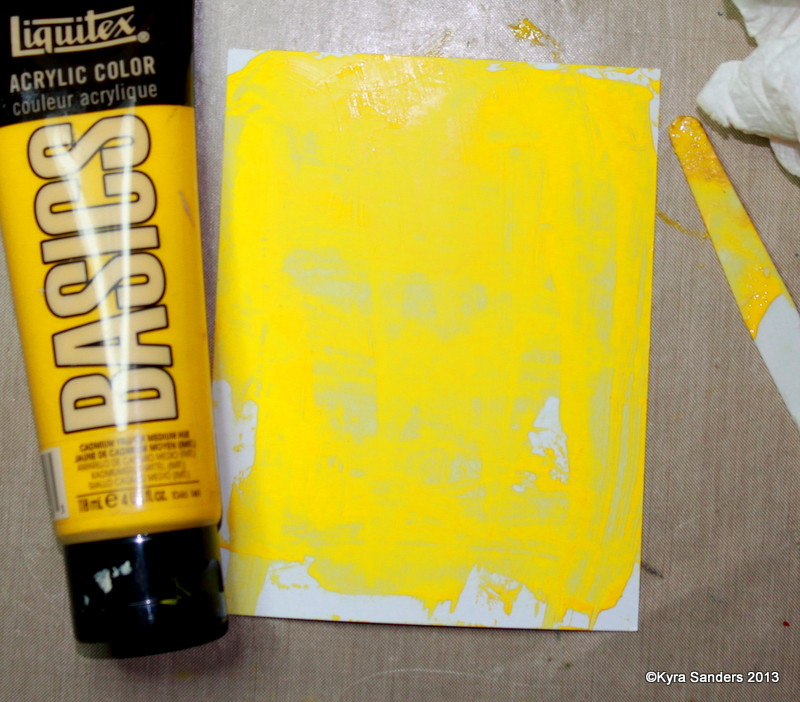
Here are some of the first prints I pulled. I used Basics acrylic paint (Michael's artist paint), Golden fluid acrylics and cheap Apple Barrel acrylic paint. They all worked about the same. If you want more time to work, mix a little fluid medium into the paint before you put it on the plate. That extends the drying time.


I used a variety of tools on my plate. I wasn't gentle because I wanted to know what my plate could do. It is really tough, and holds up to poking and smooshing. That said, it's not going to hold up if you stab it with a palette knife, but you can go into it with catalyst-type tools - I used cut cardboard, a floor adhesive texture tool, masks, and a palette knife.

I used Strathmore Bristol vellum and Gina K Designs Pure Luxury papers to pull these prints. I don't see much difference between them, except the GKD paper has a smoother finish. The paint, however, adds texture making the beginning hand of the paper moot.


This is going to be an awesome tool. I'm probably not going to use it every day, which makes the cover that much more important. Also be aware that once you unmold it, it's a bit like pandora's box - you can't fit it back in the pan the same way it was before you unmolded it. I cleaned it with a baby wipe and water. The best way to clean it is to put paper on it then let it sit until the paint is completely dry. The residual paint will stick to your paper and come off all at once this way.

I hope this encourages you to give a cheap plate a try. It's really easy and works great. Most of all, get out there and PLAY! Leave a comment if you have any questions, and I'll do my best to answer.

Ta for now,
~ky

Sunday, December 22, 2013

It's The Most Wonderful Time of the Year

It is a wonderful time of year! Maybe not the most wonderful (I like Easter a little better because it's not as commercialized) but still a great season. I love the shiny, the singing, the slightly breathless anticipation of what's to come. This year, I made more Christmas cards than I usually do. We've also spent more time in the hospital than ever before with my Dad. I also am an active choir member, which I think adds so much to this season in particular.

So, let me share some of my Christmas cards between now and new year's day. I'm also going to be ramping up the Valentine's cards, because our Operation Write Home deadline for those comes on New Year's Eve. I really enjoy sharing the love of OWH! If you enjoy cards, but don't have the time or inclination to make them - you can participate by donating toward the postage fees (we pay to ship them to our heroes), or by writing letters to encourage service-members far from home. Here's a link for you: OWH AnyHero Mail.


This card is a shaker card. That means the center piece is filled with glass crystals and glass beads so you can shake it and see motion. I love these kinds of cards, and snow globes just exemplify the winter season. I used 2 types of embossing powder - one with glitter, even! LOL Yes, I hate glitter - the herpes of the craft world!

I hope your Christmas season is shaping up the way you want. I hope you experience the magic and love of the season. Be sure to share the love!

Ta for now,
~ky

Recipe: Cardstock, Gina K Designs
Patterned paper: Basic Grey Eskimo Kisses, Carolee's Creations Snowball Fight
Stamps: Stampin' Up! Truly Grateful; Gina K Designs Season's Greetings
Die: Spellbinder's Lotus
Embossing powder: Stampin' Up! Sky Blue; Stampendous Winter Wonderland
Gina K Design's Buttons
Beading twine and miscellaneous rhinestones, Making Memories frame, May Arts ribbon, Art Institute glass glitter, misc glass beads.

Friday, December 20, 2013

Things to Do

Ok, so it's been since September that I've posted. Where does the time go? I'm going to try to do better - do I say that every post? Hahahaha!

My friend Tiffany Johnson gave us a mixed media challenge this week to use modeling paste on a project. I adore mixed media, and textures just make me so happy. Here's my card:


I mixed my texture paste on my craft sheet using two Dylusions colors squeezed orange and calypso teal (love those combinations!). I pressed them through my Heidi Swapp stencil, then found Bazzill paper to match. I punched the paper hearts (on the left side), and stitched them into a kite with a fun tail.

I stamped Tami Mayberry's Simple Hearts 'love' sentiment, embossed it with Zing fluorescent neon amber embossing powder, but it didn't match well. So, I fixed it! I carefully painted over the embossed image with gesso, then painted squeezed orange Dylusions spray over the gesso. Much better!

The base paper is Gina K Design's cardstock, Smokey Slate. I hope you get inspired to play along. Splitcoast Stampers is a wonderful, free papercrafting community. I'd love to see you there!

Ta for now,

~ky

Friday, September 20, 2013

Pain and rain

Hello friends! I recently had surgery, so I've been trying to make art from my bed. It's challenging, but I'm also learning new ways to stay creative. Because of surgery, I didn't have a chance to make a sample for the current Mix-Ability challenge on Splitcoast. It's a FUN challenge, and I encourage you to go play along. Don't shy away because there are lots of card makers on the site. Your mixed media projects of any type, size or technique are WELCOME!

This week's challenge is about using 2 types of paint on a project. Product choices like Smooch, acrylic paint, watercolor, gesso, ink, etc. meet the challenge. Here's a project I did for something else that also meets this challenge.

I made this using Distress inks and blending foam, then stamped the butterflies in acrylic paint. The sentiment is simply heat embossed in a delicate yellow to coordinate with the sun.

I hope you get a chance to play. The forum is so supportive and the people are amazing. Come join us!

Ta for now,
~ky

Thursday, September 5, 2013

Getting All Negative

Howdy! Things have been hectic here and HOT! I was so glad I got some time in the ArtLab to play even though the air conditioner is fighting 100 degree heat. Thankfully, we'll see some changes late next week. My challenge over at Splitcoast Stampers (SCS, ya know?) is to spend a little time being negative.

So much of our artistic endeavors focus on additions. More color, more layers, more more more. In the heat, less is so much more. So I've got some different ways to take away stuff for a cool effect.

First up - I went to my trusty tools from my Copic marker certification class. Color your image as you normally would, then take a little scrap of fabric with a prominent weave or texture design. Drizzle on a little blending solution, then QUICKLY set it onto the area you want to remove ink from, and lift. You don't need to press firmly - you just want a subtle texture. Let dry and observe. Here are the ones I did:


Next up, I have a project to share that uses 3 different removal techniques. I started with plain cardstock, 3 contrasting colors of acrylic paint, and a paper towel.


Slather on a layer of your brightest color (the one you want the least of showing through). Let it dry or use a heat tool. Add your next color.


 Working quickly, roll your dry paper towel over the wet layer, lifting paint until you have the look you want.


Repeat again with whatever colors you like. I added unbleached titanium over mine to tone them down a bit.


Below is the final effect. I stamped over this and cut out the pieces for my card that I wanted.


Next up is a technique I call Ink Stripping. You can use dye ink (like Memento, Distress Ink, and many other store-brands) or acrylic paint. The image on the left is one stamp, the middle one is another. When you ink up the fine dot stamp, then press the uninked large dots onto it, you get large dots inked with little dots. You are using one stamp to strip ink from another. It's addicting!


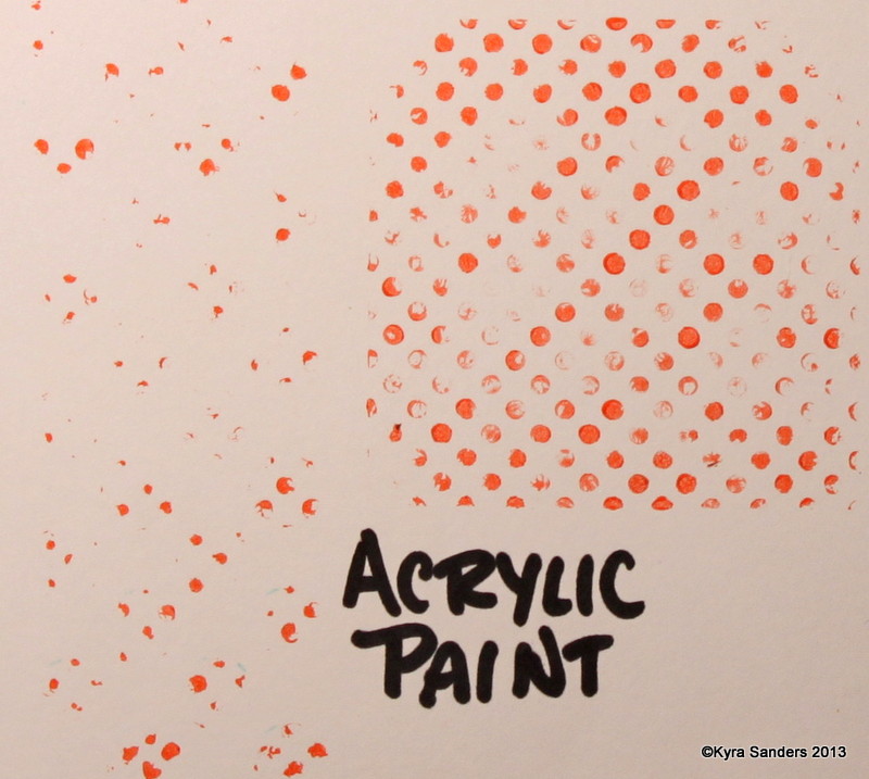
Below is how this same technique works with acrylic paint - the image of large dots of stripped paint is on the left, the residual of the little dots with paint remaining is on the right. When you reach the end of this post, the 3 large star cutouts use this technique.


Next, I used bleach on a stamp to remove colors from the cardstock. I start with a pad of folded paper towel saturated with bleach.


Yeah, I didn't get the other stamp in the picture - I used one with 3 little stars, and the larger star shown here. Normally, I won't put clear polymer stamps in caustic conditions, but I cleaned it as soon as I was done.


Now, here's the finished card. Hopefully you can pick out each of the 3 techniques, and this inspires you to focus on the negative for just a little while.


Thank you so much for visiting me today. As always, if you have questions, post them below. Join in the challenge on SCS where there will be many other projects and some discussion. It's free, and we'd love to meet you there!

Ta for now,

~ky