Sunday, December 29, 2013

Homemade Gelli

Gelli plates are all the rage right now, but they are a little too expensive for my pocketbook. Ole Santa didn't leave me enough after I paid for the gifts . So this is the method I chose.


I picked up an inexpensive ($5) covered 9x13 cake pan. The cover will help me store it without the risk of critters, dust, or bunneh hair falling into it.


I bought 2 4-pack boxes of Knox gelatin - $2 per pack. I bought 3 6-ounce bottles of plain glycerin. These are $3 apiece. My total investment was $16. For comparison, an authentic Gelli plate 12 x 14 inches is $70 retail.

The order of ingredients is important. Start by measuring out 2 cups of glycerin in a bowl. I used a plastic bowl, but glass would work too. Sprinkle 8 packets of gelatin over the glycerin and gently fold in so it has a chance to soften. Set aside.

Start some water to boil water. Pour 2 cups of boiling water gently into the glycerin/gelatin mix. Gently stir it until the gelatin is well distributed. How will you know? You won't have any loose water pooling on top of the mix. Next, carefully pour into your pan. You can use any shaped pan, and this amount with this pan yielded a half-inch thick piece of gelli.


Take a moment to remove the little bubbles. I just lightly touched the bubbles, and they either burst, or they attached themselves to my finger. This will be the BOTTOM of your gelatin plate, so I don't think it's critically important. Set it on a level shelf in your refrigerator, or if the weather's cold, set it outside. Make sure it's level and do NOT put the lid on it. You don't want to trap any condensation as it cools.

Gently loosen the gel from the edges of the pan, place a piece of sturdy material (glass, plexiglass, plastic, etc.) over the pan and invert the gelatin. If it doesn't come loose in quick fashion, you need to help it by lifting a corner free, then invert the pan again. Your gel plate is ready to play!

If you did what I did, you could end up with a tear. No worries. Cut it up and place it in a microwave safe bowl, heat until melted, then pour it back in the pan and repeat the process. You can also change it from rectangular to round by doing the same thing and using a different pan/mold. Also, this doesn't have an odor, and doesn't degrade or rot. It's very stable and needs no refrigeration.


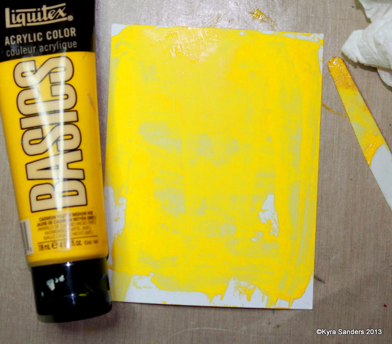
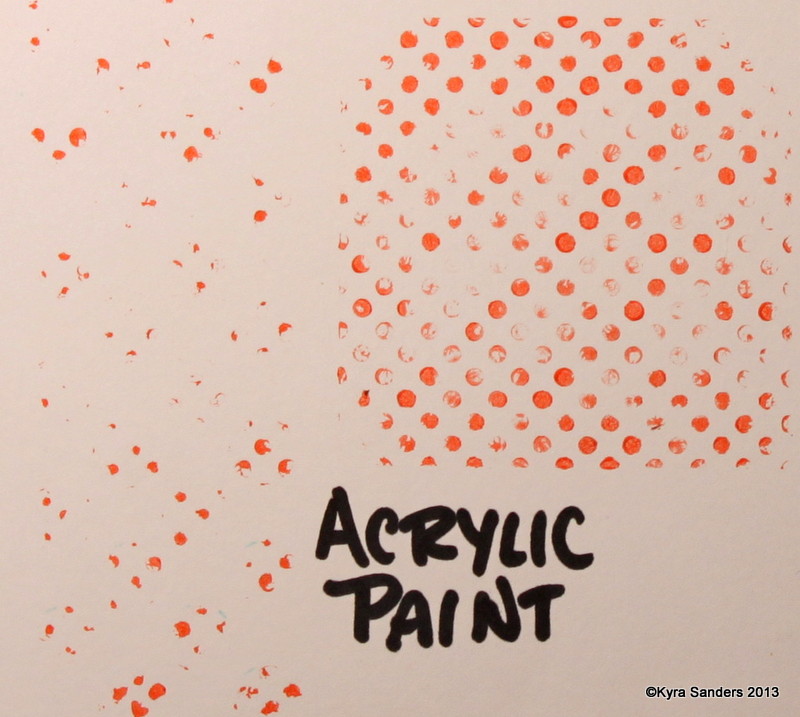
Here are some of the first prints I pulled. I used Basics acrylic paint (Michael's artist paint), Golden fluid acrylics and cheap Apple Barrel acrylic paint. They all worked about the same. If you want more time to work, mix a little fluid medium into the paint before you put it on the plate. That extends the drying time.


I used a variety of tools on my plate. I wasn't gentle because I wanted to know what my plate could do. It is really tough, and holds up to poking and smooshing. That said, it's not going to hold up if you stab it with a palette knife, but you can go into it with catalyst-type tools - I used cut cardboard, a floor adhesive texture tool, masks, and a palette knife.

I used Strathmore Bristol vellum and Gina K Designs Pure Luxury papers to pull these prints. I don't see much difference between them, except the GKD paper has a smoother finish. The paint, however, adds texture making the beginning hand of the paper moot.


This is going to be an awesome tool. I'm probably not going to use it every day, which makes the cover that much more important. Also be aware that once you unmold it, it's a bit like pandora's box - you can't fit it back in the pan the same way it was before you unmolded it. I cleaned it with a baby wipe and water. The best way to clean it is to put paper on it then let it sit until the paint is completely dry. The residual paint will stick to your paper and come off all at once this way.

I hope this encourages you to give a cheap plate a try. It's really easy and works great. Most of all, get out there and PLAY! Leave a comment if you have any questions, and I'll do my best to answer.

Ta for now,
~ky

Sunday, December 22, 2013

It's The Most Wonderful Time of the Year

It is a wonderful time of year! Maybe not the most wonderful (I like Easter a little better because it's not as commercialized) but still a great season. I love the shiny, the singing, the slightly breathless anticipation of what's to come. This year, I made more Christmas cards than I usually do. We've also spent more time in the hospital than ever before with my Dad. I also am an active choir member, which I think adds so much to this season in particular.

So, let me share some of my Christmas cards between now and new year's day. I'm also going to be ramping up the Valentine's cards, because our Operation Write Home deadline for those comes on New Year's Eve. I really enjoy sharing the love of OWH! If you enjoy cards, but don't have the time or inclination to make them - you can participate by donating toward the postage fees (we pay to ship them to our heroes), or by writing letters to encourage service-members far from home. Here's a link for you: OWH AnyHero Mail.


This card is a shaker card. That means the center piece is filled with glass crystals and glass beads so you can shake it and see motion. I love these kinds of cards, and snow globes just exemplify the winter season. I used 2 types of embossing powder - one with glitter, even! LOL Yes, I hate glitter - the herpes of the craft world!

I hope your Christmas season is shaping up the way you want. I hope you experience the magic and love of the season. Be sure to share the love!

Ta for now,
~ky

Recipe: Cardstock, Gina K Designs
Patterned paper: Basic Grey Eskimo Kisses, Carolee's Creations Snowball Fight
Stamps: Stampin' Up! Truly Grateful; Gina K Designs Season's Greetings
Die: Spellbinder's Lotus
Embossing powder: Stampin' Up! Sky Blue; Stampendous Winter Wonderland
Gina K Design's Buttons
Beading twine and miscellaneous rhinestones, Making Memories frame, May Arts ribbon, Art Institute glass glitter, misc glass beads.

Friday, December 20, 2013

Things to Do

Ok, so it's been since September that I've posted. Where does the time go? I'm going to try to do better - do I say that every post? Hahahaha!

My friend Tiffany Johnson gave us a mixed media challenge this week to use modeling paste on a project. I adore mixed media, and textures just make me so happy. Here's my card:


I mixed my texture paste on my craft sheet using two Dylusions colors squeezed orange and calypso teal (love those combinations!). I pressed them through my Heidi Swapp stencil, then found Bazzill paper to match. I punched the paper hearts (on the left side), and stitched them into a kite with a fun tail.

I stamped Tami Mayberry's Simple Hearts 'love' sentiment, embossed it with Zing fluorescent neon amber embossing powder, but it didn't match well. So, I fixed it! I carefully painted over the embossed image with gesso, then painted squeezed orange Dylusions spray over the gesso. Much better!

The base paper is Gina K Design's cardstock, Smokey Slate. I hope you get inspired to play along. Splitcoast Stampers is a wonderful, free papercrafting community. I'd love to see you there!

Ta for now,

~ky

Friday, September 20, 2013

Pain and rain

Hello friends! I recently had surgery, so I've been trying to make art from my bed. It's challenging, but I'm also learning new ways to stay creative. Because of surgery, I didn't have a chance to make a sample for the current Mix-Ability challenge on Splitcoast. It's a FUN challenge, and I encourage you to go play along. Don't shy away because there are lots of card makers on the site. Your mixed media projects of any type, size or technique are WELCOME!

This week's challenge is about using 2 types of paint on a project. Product choices like Smooch, acrylic paint, watercolor, gesso, ink, etc. meet the challenge. Here's a project I did for something else that also meets this challenge.

I made this using Distress inks and blending foam, then stamped the butterflies in acrylic paint. The sentiment is simply heat embossed in a delicate yellow to coordinate with the sun.

I hope you get a chance to play. The forum is so supportive and the people are amazing. Come join us!

Ta for now,
~ky

Thursday, September 5, 2013

Getting All Negative

Howdy! Things have been hectic here and HOT! I was so glad I got some time in the ArtLab to play even though the air conditioner is fighting 100 degree heat. Thankfully, we'll see some changes late next week. My challenge over at Splitcoast Stampers (SCS, ya know?) is to spend a little time being negative.

So much of our artistic endeavors focus on additions. More color, more layers, more more more. In the heat, less is so much more. So I've got some different ways to take away stuff for a cool effect.

First up - I went to my trusty tools from my Copic marker certification class. Color your image as you normally would, then take a little scrap of fabric with a prominent weave or texture design. Drizzle on a little blending solution, then QUICKLY set it onto the area you want to remove ink from, and lift. You don't need to press firmly - you just want a subtle texture. Let dry and observe. Here are the ones I did:


Next up, I have a project to share that uses 3 different removal techniques. I started with plain cardstock, 3 contrasting colors of acrylic paint, and a paper towel.


Slather on a layer of your brightest color (the one you want the least of showing through). Let it dry or use a heat tool. Add your next color.


 Working quickly, roll your dry paper towel over the wet layer, lifting paint until you have the look you want.


Repeat again with whatever colors you like. I added unbleached titanium over mine to tone them down a bit.


Below is the final effect. I stamped over this and cut out the pieces for my card that I wanted.


Next up is a technique I call Ink Stripping. You can use dye ink (like Memento, Distress Ink, and many other store-brands) or acrylic paint. The image on the left is one stamp, the middle one is another. When you ink up the fine dot stamp, then press the uninked large dots onto it, you get large dots inked with little dots. You are using one stamp to strip ink from another. It's addicting!


Below is how this same technique works with acrylic paint - the image of large dots of stripped paint is on the left, the residual of the little dots with paint remaining is on the right. When you reach the end of this post, the 3 large star cutouts use this technique.


Next, I used bleach on a stamp to remove colors from the cardstock. I start with a pad of folded paper towel saturated with bleach.


Yeah, I didn't get the other stamp in the picture - I used one with 3 little stars, and the larger star shown here. Normally, I won't put clear polymer stamps in caustic conditions, but I cleaned it as soon as I was done.


Now, here's the finished card. Hopefully you can pick out each of the 3 techniques, and this inspires you to focus on the negative for just a little while.


Thank you so much for visiting me today. As always, if you have questions, post them below. Join in the challenge on SCS where there will be many other projects and some discussion. It's free, and we'd love to meet you there!

Ta for now,

~ky

Friday, August 30, 2013

Go on - Be a DRIP

Hello! Today's mixed media challenge on Splitcoast Stampers (SCS) is to cake on any color medium and add water to make it drip and run. I started with the cast-off from a die I cut in ivory cardstock, added thick acrylic paint (Golden's fluid acrylics) with water to make it run down the cardstock. I cut the cast-off down to ATC size (2.5 inches by 3.5 inches).


I lined the cast-off with paper from My Mind's Eye Lost and Found Breeze so the sentiment would show. I punched a border from Bazzill cardstock for the top. The bottom is a composite of twine, MME patterned paper (same paper stack), metallic sequins (WalMart, custom colored with Adirondack alcohol inks), and Paper Studio rhinestones.


I hope you'll be inspired to create a little something before you get into full swing of celebrating the last of the summer days leading to autumn. Thanks for visiting!

Ta for now,
~ky

Friday, August 23, 2013

Fabric Flags

Hello! Today begins a new week of Mix-Ability challenges on Splitcoast Stampers. We are encouraging people to play with their products in a way that mixes media beyond what the central focus is for cards in general. Any form of project is welcomed in these challenges, so get out your art journal and play along!

This week's challenge is by Birgit, who lays down the gauntlet of using fabric in your design. I just love playing with fabric, so I'm confident I'll play this challenge more than once! Here's what I created:


What pirate doesn't need flags? The image is Amora by Terra Bidlespacher, and the sentiment is from one of Tim Holtz through Stampers Anonymous. I love it - "Imagination is more important than knowledge for while knowledge defines all we currently know and understand, imagination leads us to all we might yet discover and create." I think that is so true!

I hope you get a chance to play along. It's free, and you can upload your project to the gallery to see what everyone thinks about your work. It's a very kind and encouraging collection of crafters, so don't be afraid.

I hope to get more regular at posting to this blog. I have a lot of things to share with you. Thanks for visiting, and I would love to hear from you.

Ta for now,
~ky

Paper: 7 Gypsies and Gina K Designs
Ink: Distress inks (water activated), Copic markers, Memento dye ink.
Stamps: Terra Bidlespacher (Amora), Tim Holtz via Stampers Anonymous (Mini Ornate, Air Travel)
Fabric: Creative Imaginations, misc bakers twine.

Friday, August 16, 2013

Brutal Busy

No, it's not that it's summer and close to school. I'm working on a lot of things, and it's been hard keeping up with everything I want when everything I must do requires more of my time. You deal with it too, right?

Here's a little project I was able to squeeze in because it was fast, and because it has such awesome results. It doesn't require special equipment or a lot of supplies. All you need are some Distress Ink pads, a flat circle of plastic or cardstock, a drop or 2 of a reinker, a stamp you love (or 2), some water, a straw and maybe a white gel pen.


This is an ATC that I created using the above list of supplies. I sometimes use a can of compressed air to move the reinker around. Here's my process:


So there you have it. If you have any questions, feel free to post them in the comments. Thanks so much for visiting!

Ta!
~ky

Saturday, July 20, 2013

Swap and Trade

Hey there folks! I've been very busy and spent a lot of time contemplating whether or not I should resurrect my blog. I've decided I should give it a try, despite the lack of comments and traffic. If you have any suggestions about my blog, please kindly leave me a message. I would greatly appreciate constructive ideas!

I am a proud member of the Splitcoaststampers' newest challenge site. It's all about mixed-media! I do hope you'll check it out, and play along. Share your work here on my blog - just add a link in the comments - because I want to give you some love! Here's an art journal page I did a few weeks ago. Our challenge by Tiffany (IHeartArt is her blog) was to use multiple surfaces in the creation of our project.


I pulled together a lot of surfaces because I love collages. I started with gesso over a layer of distress inks, then built more layers with tape, gesso and bits of papers. My surfaces include: cardstock, medical tape, corrugated cardboard, Styrofoam  twine, vellum, metallic paint, acrylic paint, tissue paper, gesso, wooden stir stick, and machine stitching. The text on the embossed vellum says: 


"As a son, a man receives love. As a husband, a man shares his love. And as a father, a man gives his love." 

This will have a good bit of journaling about my life with my Dad. He's an amazing man whom I am getting a chance to be with day in and day out.


These pieces are Artist Trading Cards (ATCs). I participated in an ATC swap on Tamara's Willowing website. My partner was Sherri Mash, and she sent me the ATCs on the right.

Our theme was summer travel, and I created the ATCs on the right. I used Tim Holtz's and BoBunny papers, Distress ink, miscellaneous brads, ribbon, spinner. The gold edging is Viva Modeling Cream (Love this stuff!). I used Prismacolor pencils on the truck, and the stamps are by Tim Holtz and Gina K Designs.

I hope you've enjoyed your visit here. Feel free to follow me, or 'like' my Facebook studio: the ArtLab. Head out into the land of art, inspired!

~ky

Friday, March 29, 2013

Mix-Ability

Hello my friends! I want to tell you about an awesome new mixed-media challenge site. Splitcoast Stampers has a challenge specifically for getting to know and use mixed media methods for making cards. BUT you can easily follow along using your art journals! It's called the mix-ability challenge. Here's a project I did for one of them.


At first, I was resistant to the idea of using these techniques for cards. Why? I don't know - maybe my OCD is showing! This was the first challenge, called Yin Yang, to use something shiny (here it's the embossing powder, shiny ribbon, and rhinestones) and something matte (I used matte brads, and Pan Pastels). See? Easy and fun challenges!

So what are you waiting for? Run on over and check it out. If you make a project for any of the challenges - come back and link me so I can see and show you some love! Remember, these do NOT have to be cards, and they are just for fun, so get going!

Ta for now,
~ky

Recipe:
Cardstock, Gina K Designs
Patterned paper: Basic Grey, Wisteria
Images, Gina K Designs Bold and Beautiful
Inks, Versamark, Memento
Brads, ribbon and rhinestones: Basic Grey, Making Memories, Michaels
Coloring, Pan Pastels
Embossing powder, Ranger, Inc.

Sunday, February 3, 2013

Friends and Neighbors

It's been a long road, but finally, the ArtLab is functional! It's still a bit of a train wreck, but I can get to all of my wonderful toys! Yay!!

Some friends of mine from the author side of my life decided we needed to form a small sub-group to work on a different brand of creativity. We had our first Google Hangout today. It was supposed to last about an hour, but we didn't close out until FOUR hours later! It was a LOT of fun!

We started by talking about new toys we had from Christmas (ahem, we did get Tim to take the plastic wrap off his goodies), and shared some projects we had done recently. Jade showed us a rocking watercolored bird piece that graced a front magazine cover. She's amazing with the watercolors, folks. Once we get everything ginning along, I'll try to link you all up with some of their art. Seriously good talent!

Jade pointed us to a 'new' blog (new to me) that posts a new prompt every Friday. It's Illustration Friday, and this week's prompt was "Wheel". In true Naperville fashion, we jumped in with both feet! We had a little conversation about how to approach the prompt, then each of us dove in to creating our piece. It was really cool. Here's mine:

7x10 inch Mixed Media Canson journal
I chose to use a 'wheel' to represent the circular passing of seasons. Lately the weather has been center-stage, so I'm sure those latent thoughts surfaced in this piece. I will be adding some text to this, and I'll post the final piece later.

I painted the basic tree frame with Neocolor II water soluble wax pastels over a mixed acrylic/pearl mist background created from leftovers of another project. I stamped lots of leaves then painted those. I worked distress inks into the tree crown to mimic the different colors of leaf progression through the year. Then I added depth and dimension with round dot stamps (Papertrey Ink), and mistable masks. I also used my Copic markers to give better definition to the tree and some other bits on the page.

Next we played a familiar game of word associations. We started with banana, took a detour to Mt. Everest, and wound our way back to dinosaurs. Tim was our tour guide and read our list back to us. The resulting prompt? Plaid Dinosaurs! Rawr!!

3.5 x 3.5 inch tile on Strathmore Mixed Media paper
Copic multiliners shaded with Copic markers
I came up with my take on a prehistoric (dino) fish hanging out with some bananas, a bird and done in black and white zendoodling. My plaid isn't the traditional plaid, but I think it turned out just fine. That's what we did today.

If you want to use these prompts and come up with your own interpretation  feel free. Be sure to come back and link me to your work, because I want to see it!

Thanks so much for your patience while I got my studio back together. I'm so glad you dropped by!

Ta for now,

~ky